
Poster Analysis (Jordan)
The Film Title: THE CONJURING
Year of Release: July 19th 2013
Director: James Wan
Production/Financing Company: Warner Bros
Introduction: The conjuring is a film loosely based on the real life events of Ed and Lorraine Warren. With the film on a relatively small budget of $20 million when comparing to a film like wolverine who had $120 million, the filming took place in Wilmington, north Carolina. The film was produced by several studios including The Safran Company and New Line Cinema and distributed by New Line’s parent company Warner Bros. Pictures. The conjuring was released in US and Canada on the 19th of July this year, and Canada on the 19th of July this year, and later on the 2nd of August in the UK and India.
Principle Cast: Vera Farmiga as Lorraine Warren, Patrick Wilson as Ed Warren, Lili Taylor as Carolyn Perron, Ron Livingston as Roger Perron, Shanley Caswell as Andrea Perron, Hayley McFarland as Nancy Perron, Joey King as Christine Perron, Mackenzie Foy as Cindy Perron, Kyla Deaver as April Perron, Shannon Kook as Drew, John Brotherton as Brad, Sterling Jerkins as Judy Warran, Marion Gayot as Georgiana Moran, Steve Coulter as Father Gorden, and Joseph Bishara as Bathsheba.
Films Origin/Info: Adaptation: The conjuring was based on a true story there wasn't a script until the film was shown to a producer a couple years back by Lorraine Warren and Ed Warren, apparently the conjuring is based on a true story as the warren family lived in a house which had supernatural things going on, once the film was shown to the producers, there wanted to go through with the film and that’s when there produced a script.
Sequel: An article online said that there would be a conjuring 2, which would take back the warren family to the 1970's, as The case file they’re looking at occurs in the late '70's and centers on two sisters in En-field, England, who were allegedly possessed. An article said to call the conjuring the horror movie hit of 2013 so far would quite fitting. Director James Wan’s R-rated supernatural scare fest has already grossed more than six times its $20 million budget worldwide in threaters, in addition to earning critical kudos, for old-fashioned spooking tactics and Wan’s technical expertise. New Line Cinema gave the go-ahead for development on a sequel before Wan’s film began its theatrical run, needless to say, the studios instincts were right on the money in this case.
Franchise: A website said the conjurer already being eyed as the first film in a new horror franchise, an article said ‘’The conjuring wasn't even out yet earlier this week, but New Line Cinema is already moving forward with plans to develop a new horror franchise with two of its characters as the focus. The conjuring currently holds a Certified Fresh RT Tomatometer rating of 85%. The plan is to base future films on other haunting cases investigated by real life paranormal experts Ed and Lorraine Warren, portrayed in The Conjuring by Patrick Wilson and Vera Farmiga. Some of the Warrens' cases have already been adapted to film, most notably as The Amityville Horror and the haunting in Connecticut.
Re-Make: I believe that there would be a re-make of the conjuring due to how big it came within weeks, the conjuring would be a horror to be remember, I think there will be a re-make in the years to come. However an article online said that ‘’ While most of the world are congratulating James Wan on his skillful mastery of fear in his newest horror offering The Conjuring, based on the “true story” of the Perron family who lived in a haunted farmhouse in 1971. There are a few folks who claim that The Conjuring is a remake of a 1991 made for television movie called The Haunted’’.
Synopsis: A demonic entity lays claim to family living in a secluded farmhouse, prompting them to seek the aid of two renowned paranormal researchers in this tale of possession inspired by actual events. The story gets underway as paranormal researchers Ed (Patrick Wilson) and Lorraine Warren (Vera Farmiga) evaluate a mysterious doll discovered by a trio of young roommates in 1968. Believing their house to be haunted by the wayward spirit of a deceased young girl, they give the girl permission to inhabit the doll, and soon their lives become a waking nightmare. Informed by Ed and Lorraine that they have fallen victim to an inhuman spirit (aka a demon) seeking a human host, the roommates entrust the doll to the Warrens, who place it in their personal museum for safekeeping. Flash forward three years to Harrisville, RI, where the Perron family have just moved into their country dream home -- an 18th century farmhouse that offers plenty of space for parents Carolyn (Lili Taylor) and Roger (Ron Livingston), as well as their five daughters Andrea (Shanley Caswell), Nancy (Hayley McFarland), Christine (Joey King), Cindy (Mackenzie Foy), and April (Kyla Deaver). It seems like the ideal place to raise a family until a series of unsettling events leave the Perron family convinced they are not alone. Terrified, Carolyn reaches out to the Warrens for help, and learns that a demonic entity has attached itself to her family, and has no intentions of letting them go. Meanwhile, the deeper the Warrens delve into the farmhouse's history, the clearer it becomes that this spirit has a murderous agenda, and that no one will be safe until it is driven back into darkness.
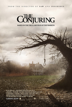
Main Image/Composition/Layout: Looking from the film poster above you can see that it is Asymmetrical. The main image is a long shot of a house.
Focus: The focus is very soft as it is kind of blurred as you can see the house but it does lack focus, the main focus is put on the rope on the tree which looks like it was a place for hanging people, this could be true as this film is based in the 1970s.
Colour: The colour used is mainly grey; grey is used to connote the weather showing that it is not a nice day which can connote the house being grey implying that there is something weird or unusual in the house. The use of making the tree black also connotes something supernatural happens; also due to no leaves being on there can also imply something.
Anchorage: The use of the word ‘The Conjuring’ implies that this film is based on supernatural things; also with the use of the word ‘July 19th’ it notifies audiences that see the poster when the movie is out.
Type Of Font: The font used on the poster is serif fonts as the poster features small caps and flick ups, this font connotes old fashioned, which is why the conjuring use this serif font as the conjuring was based on a true real life events back in the 1970s.
Conventions: The movie poster doesn’t really follow any conventions of a specific genre of film, but looking at the poster, the film poster uses its own conventions to imply it’s a supernatural sub genre, this is shown with the use of the soft focus, where it mainly focuses on the rope hanging from the tree, and the use of the mist in the background can also imply something but with the conventions on the actual poster there isn’t really a significant conventions that imply what sub genre it’s in.
Mood: The mood the conjuring film try’s to convey is very hidden, there want the audience to look deeper into the film and to find out more, when looking the film poster I get the sense that there is something unusual and unnatural, the use of the grey sky implies something dark is here.
Font/Names: The conjuring has a presentation of film stars as their names appear below the title in the corner in big capital letters, there want us to know who’s in the film as there are big actors featured in the film which can possibly attract more audiences in to watch the film.
Credits: The film’s release date was July 19th, but the film poster and teaser trailer came like 1 to 2 months early, when seeing this it made me mysterious and intrigued, and I wanted to see the film desperately, there movie campaign intended to entice audiences curiosity without revealing too much. Posters later in the campaign will be more explicit, possibly revealing details about the plot.
Colour: The film poster uses more harsh and intense colours which is there to represent a moody or dark film, which is very attractive when it comes to horror films.
Tagline: The conjuring doesn’t really have a tagline but there have a short sentence on the film poster which says ‘Based on the case files of the warrens’ which implies its based on a true story.
Quotes: There wasn’t quotes I seen from critics praising there film, but what i saw was a at the top of the poster in big capital letters was ‘ From the director of saw and insidious’ due to these two films being hug successful films, there imply this too wouldn’t be one to miss.
Additional Information: On the trailer of the conjuring it has 53 cuts over 2:34 minutes, which is considerably less than ‘The wolverine’ trailer, which had around 116, even though this trailer seems to have a decreased pace, this may be due to the fact that this trailer is for a horror film, and not an action film. The tension is built up by the suspense of long cuts, rather than the build up of many quicker cuts.
Conclusion: Overall I think that this poster is very effective; the use of the layout and main image is very attracting. Also the use of colour is very well presented as the colour scheme attracts me as an audience member and makes me sense that this film is based on something supernatural or unsual. The use of the font/names, made me even more interested as well known actor is in this film which would make me more likely to go watch the film. Furthermore the film poster included a credit which said from the director of saw and insidious which I think is very effective to get audience’s attention. As whole I believe this film poster was done to its fullest and you can see the time the movie campaign took to do it, it is very attractive and due to the poster, The conjuring will go down as a historic film.
Year of Release: July 19th 2013
Director: James Wan
Production/Financing Company: Warner Bros
Introduction: The conjuring is a film loosely based on the real life events of Ed and Lorraine Warren. With the film on a relatively small budget of $20 million when comparing to a film like wolverine who had $120 million, the filming took place in Wilmington, north Carolina. The film was produced by several studios including The Safran Company and New Line Cinema and distributed by New Line’s parent company Warner Bros. Pictures. The conjuring was released in US and Canada on the 19th of July this year, and Canada on the 19th of July this year, and later on the 2nd of August in the UK and India.
Principle Cast: Vera Farmiga as Lorraine Warren, Patrick Wilson as Ed Warren, Lili Taylor as Carolyn Perron, Ron Livingston as Roger Perron, Shanley Caswell as Andrea Perron, Hayley McFarland as Nancy Perron, Joey King as Christine Perron, Mackenzie Foy as Cindy Perron, Kyla Deaver as April Perron, Shannon Kook as Drew, John Brotherton as Brad, Sterling Jerkins as Judy Warran, Marion Gayot as Georgiana Moran, Steve Coulter as Father Gorden, and Joseph Bishara as Bathsheba.
Films Origin/Info: Adaptation: The conjuring was based on a true story there wasn't a script until the film was shown to a producer a couple years back by Lorraine Warren and Ed Warren, apparently the conjuring is based on a true story as the warren family lived in a house which had supernatural things going on, once the film was shown to the producers, there wanted to go through with the film and that’s when there produced a script.
Sequel: An article online said that there would be a conjuring 2, which would take back the warren family to the 1970's, as The case file they’re looking at occurs in the late '70's and centers on two sisters in En-field, England, who were allegedly possessed. An article said to call the conjuring the horror movie hit of 2013 so far would quite fitting. Director James Wan’s R-rated supernatural scare fest has already grossed more than six times its $20 million budget worldwide in threaters, in addition to earning critical kudos, for old-fashioned spooking tactics and Wan’s technical expertise. New Line Cinema gave the go-ahead for development on a sequel before Wan’s film began its theatrical run, needless to say, the studios instincts were right on the money in this case.
Franchise: A website said the conjurer already being eyed as the first film in a new horror franchise, an article said ‘’The conjuring wasn't even out yet earlier this week, but New Line Cinema is already moving forward with plans to develop a new horror franchise with two of its characters as the focus. The conjuring currently holds a Certified Fresh RT Tomatometer rating of 85%. The plan is to base future films on other haunting cases investigated by real life paranormal experts Ed and Lorraine Warren, portrayed in The Conjuring by Patrick Wilson and Vera Farmiga. Some of the Warrens' cases have already been adapted to film, most notably as The Amityville Horror and the haunting in Connecticut.
Re-Make: I believe that there would be a re-make of the conjuring due to how big it came within weeks, the conjuring would be a horror to be remember, I think there will be a re-make in the years to come. However an article online said that ‘’ While most of the world are congratulating James Wan on his skillful mastery of fear in his newest horror offering The Conjuring, based on the “true story” of the Perron family who lived in a haunted farmhouse in 1971. There are a few folks who claim that The Conjuring is a remake of a 1991 made for television movie called The Haunted’’.
Synopsis: A demonic entity lays claim to family living in a secluded farmhouse, prompting them to seek the aid of two renowned paranormal researchers in this tale of possession inspired by actual events. The story gets underway as paranormal researchers Ed (Patrick Wilson) and Lorraine Warren (Vera Farmiga) evaluate a mysterious doll discovered by a trio of young roommates in 1968. Believing their house to be haunted by the wayward spirit of a deceased young girl, they give the girl permission to inhabit the doll, and soon their lives become a waking nightmare. Informed by Ed and Lorraine that they have fallen victim to an inhuman spirit (aka a demon) seeking a human host, the roommates entrust the doll to the Warrens, who place it in their personal museum for safekeeping. Flash forward three years to Harrisville, RI, where the Perron family have just moved into their country dream home -- an 18th century farmhouse that offers plenty of space for parents Carolyn (Lili Taylor) and Roger (Ron Livingston), as well as their five daughters Andrea (Shanley Caswell), Nancy (Hayley McFarland), Christine (Joey King), Cindy (Mackenzie Foy), and April (Kyla Deaver). It seems like the ideal place to raise a family until a series of unsettling events leave the Perron family convinced they are not alone. Terrified, Carolyn reaches out to the Warrens for help, and learns that a demonic entity has attached itself to her family, and has no intentions of letting them go. Meanwhile, the deeper the Warrens delve into the farmhouse's history, the clearer it becomes that this spirit has a murderous agenda, and that no one will be safe until it is driven back into darkness.
Main Image/Composition/Layout: Looking from the film poster above you can see that it is Asymmetrical. The main image is a long shot of a house.
Focus: The focus is very soft as it is kind of blurred as you can see the house but it does lack focus, the main focus is put on the rope on the tree which looks like it was a place for hanging people, this could be true as this film is based in the 1970s.
Colour: The colour used is mainly grey; grey is used to connote the weather showing that it is not a nice day which can connote the house being grey implying that there is something weird or unusual in the house. The use of making the tree black also connotes something supernatural happens; also due to no leaves being on there can also imply something.
Anchorage: The use of the word ‘The Conjuring’ implies that this film is based on supernatural things; also with the use of the word ‘July 19th’ it notifies audiences that see the poster when the movie is out.
Type Of Font: The font used on the poster is serif fonts as the poster features small caps and flick ups, this font connotes old fashioned, which is why the conjuring use this serif font as the conjuring was based on a true real life events back in the 1970s.
Conventions: The movie poster doesn’t really follow any conventions of a specific genre of film, but looking at the poster, the film poster uses its own conventions to imply it’s a supernatural sub genre, this is shown with the use of the soft focus, where it mainly focuses on the rope hanging from the tree, and the use of the mist in the background can also imply something but with the conventions on the actual poster there isn’t really a significant conventions that imply what sub genre it’s in.
Mood: The mood the conjuring film try’s to convey is very hidden, there want the audience to look deeper into the film and to find out more, when looking the film poster I get the sense that there is something unusual and unnatural, the use of the grey sky implies something dark is here.
Font/Names: The conjuring has a presentation of film stars as their names appear below the title in the corner in big capital letters, there want us to know who’s in the film as there are big actors featured in the film which can possibly attract more audiences in to watch the film.
Credits: The film’s release date was July 19th, but the film poster and teaser trailer came like 1 to 2 months early, when seeing this it made me mysterious and intrigued, and I wanted to see the film desperately, there movie campaign intended to entice audiences curiosity without revealing too much. Posters later in the campaign will be more explicit, possibly revealing details about the plot.
Colour: The film poster uses more harsh and intense colours which is there to represent a moody or dark film, which is very attractive when it comes to horror films.
Tagline: The conjuring doesn’t really have a tagline but there have a short sentence on the film poster which says ‘Based on the case files of the warrens’ which implies its based on a true story.
Quotes: There wasn’t quotes I seen from critics praising there film, but what i saw was a at the top of the poster in big capital letters was ‘ From the director of saw and insidious’ due to these two films being hug successful films, there imply this too wouldn’t be one to miss.
Additional Information: On the trailer of the conjuring it has 53 cuts over 2:34 minutes, which is considerably less than ‘The wolverine’ trailer, which had around 116, even though this trailer seems to have a decreased pace, this may be due to the fact that this trailer is for a horror film, and not an action film. The tension is built up by the suspense of long cuts, rather than the build up of many quicker cuts.
Conclusion: Overall I think that this poster is very effective; the use of the layout and main image is very attracting. Also the use of colour is very well presented as the colour scheme attracts me as an audience member and makes me sense that this film is based on something supernatural or unsual. The use of the font/names, made me even more interested as well known actor is in this film which would make me more likely to go watch the film. Furthermore the film poster included a credit which said from the director of saw and insidious which I think is very effective to get audience’s attention. As whole I believe this film poster was done to its fullest and you can see the time the movie campaign took to do it, it is very attractive and due to the poster, The conjuring will go down as a historic film.
Poster Analysis (Riley)
Film Title: Orphan
Year of Release: 2009
Director: Jaume Collet-Serra
Production/Financing Company: production-Dark Castle Entertainment, financing- Studiocanal
Principle Cast: Isabelle Fuhrman, Peter Sarsgaard, Vera Farmiga.
Film Origin: Feature film.
Synopsis: Kate and John Coleman are rebuilding their troubled marriage. Kate had a drinking problem, but is in therapy and is doing well. She has been sober for one year. The couple decide to adopt a child. When they meet the nine-year-old Russian girl, Esther, at the St. Marina Orphanage, they immediately fall in love with the well-educated orphan. Their young son, Daniel, is hostile to his new sister; but their deaf daughter, little Max, is enchanted with her - at first. Eventually, Kate begins to feel that Esther is manipulative and possibly even psychologically disturbed. John refuses to listen to his wife's misgivings, and the wounds in their marriage reopen. Kate calls Sister Abigail at the orphanage, and the nun informs her that Esther has a troubled and mysterious history. Kate delves further into Esther's past and discovers she is not all she pretends to be.
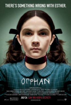
Main Image: The main image is a medium close up of the main character (head and shoulders). She faces straight on to the camera so you can see her clearly. Her facial expression is very neutral and emotionless maybe showing what the character's personality is like.
Tag-Line: The tag-line says "There's Something Wrong With Esther" this does not give too much away about the film but creates a mysterious vibe to the character. It makes the audience ask questions, and grabs their attention by wanting them to find out more.
Mood: The mood portrayed in the poster is dark and mysterious. The girl in the main photograph holds a very emotionless face. The colours and tones used within the poster also add to the mysterious, eerie mood. The girl’s pose is very neutral, not giving away too much about her character (or giving everything away…).
Font/Names: This poster does not name any of the cast that appear within the movie, which means the film studio is selling something other than the cast (the storyline etc.) .
Credits: The release date of the film is placed near the bottom of the poster in bold, slightly bigger font than the rest. Above the release date is the production company details, this is in smaller, less bold font.
Colour: The colours use within the main photograph and poster are very deep, rich colours, with dark tones, creating a mysterious mood.
Mise-en-Scene: The lighting within the poster is quite high-key as the face of the main subject is well lit. There are no props used within the poster. The main subjects costume is very tidy and neat, and she wears dark coloured clothes. the setting is very neutral, there isn't much of a background, as it is just a plain medium tone colour.
Year of Release: 2009
Director: Jaume Collet-Serra
Production/Financing Company: production-Dark Castle Entertainment, financing- Studiocanal
Principle Cast: Isabelle Fuhrman, Peter Sarsgaard, Vera Farmiga.
Film Origin: Feature film.
Synopsis: Kate and John Coleman are rebuilding their troubled marriage. Kate had a drinking problem, but is in therapy and is doing well. She has been sober for one year. The couple decide to adopt a child. When they meet the nine-year-old Russian girl, Esther, at the St. Marina Orphanage, they immediately fall in love with the well-educated orphan. Their young son, Daniel, is hostile to his new sister; but their deaf daughter, little Max, is enchanted with her - at first. Eventually, Kate begins to feel that Esther is manipulative and possibly even psychologically disturbed. John refuses to listen to his wife's misgivings, and the wounds in their marriage reopen. Kate calls Sister Abigail at the orphanage, and the nun informs her that Esther has a troubled and mysterious history. Kate delves further into Esther's past and discovers she is not all she pretends to be.
Main Image: The main image is a medium close up of the main character (head and shoulders). She faces straight on to the camera so you can see her clearly. Her facial expression is very neutral and emotionless maybe showing what the character's personality is like.
Tag-Line: The tag-line says "There's Something Wrong With Esther" this does not give too much away about the film but creates a mysterious vibe to the character. It makes the audience ask questions, and grabs their attention by wanting them to find out more.
Mood: The mood portrayed in the poster is dark and mysterious. The girl in the main photograph holds a very emotionless face. The colours and tones used within the poster also add to the mysterious, eerie mood. The girl’s pose is very neutral, not giving away too much about her character (or giving everything away…).
Font/Names: This poster does not name any of the cast that appear within the movie, which means the film studio is selling something other than the cast (the storyline etc.) .
Credits: The release date of the film is placed near the bottom of the poster in bold, slightly bigger font than the rest. Above the release date is the production company details, this is in smaller, less bold font.
Colour: The colours use within the main photograph and poster are very deep, rich colours, with dark tones, creating a mysterious mood.
Mise-en-Scene: The lighting within the poster is quite high-key as the face of the main subject is well lit. There are no props used within the poster. The main subjects costume is very tidy and neat, and she wears dark coloured clothes. the setting is very neutral, there isn't much of a background, as it is just a plain medium tone colour.
Poster Analysis (Diana)
The film Title: Halloween
Year of Release: 2007
Director: Rob Zombie
Production/Financing Company: Dimension films(production)
Principle cast: Scout Taylor-Compton, Malcolm McDowell, Tyler Mane
Films Origin/Info: Adaptation? Sequel? Franchise? Re-make? Halloween is a remake of the 1978 version, directed by John Carpenter. Halloween is also an American Horror franchise which consists of 10 slasher films; Halloween (1978), Halloween 2 (1981), Halloween 3: season of the witch, Halloween 4: The return of Michael Myers (1988),Halloween: The revenge of Michael Myers (1989)Halloween: The curse of Michael Myers(1995), Halloween H20: 20 Years Later(1998), Halloween: Resurrection(2002) ,Halloween(2007), Halloween 2 (2009)
Synopsis: After being committed for 17 years Michael Myers(antagonist) now a grown man and still very dangerous, escapes from the mental institution where he was committed as a 10 year old and he immediately returns to Haddonfield, where he wants to find his baby sister Laurie. Anyone who crosses his path is in mortal danger.
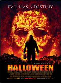
Main image: The main image is a close up of a male characters face with people’s faces and props placed directly on nearly his entire face, who may be his victims! He has a blank expression on his face and no eyeballs, just darkness. In front of the main image is a long shot of a subject who has his back to the camera, wearing dark clothing and holding two props in both hands.
Tagline: The tagline says “Evil has a destiny “One interpretation of that is, People who do evil things or are classed as evil are destined to do evil or act in an evil manner. The word ‘evil’ connotes bad intentions and dark thoughts which are associated around the horror theme/genre.
Mood: The poster conveys a dark and gloomy mood, which implies that the film is not a ray of sunshine and will involve evil and fear. It also gives the impression of creepiness.
Font/names: The director’s name is shown clearly above the title of the film in a white sans serif font,” A Rob Zombie film” which emphasises his huge role in the participation of this film, and informs horror film viewers who have enjoyed previous films he has directed and trust that this film will also be a success. However the cast’s names aren’t shown as clearly on the poster and are placed at the bottom of the page, alongside the rest of the credits.
Credits: The release date of the film is shown below the page in bold red writing. Alongside production companies that were involved with the film, which are not so emphasised like the release date and the director’s name.
Colour: The colour scheme of this poster is sun orange yellow and black, which is basic but harsh which represents the Halloween theme colours, orange is usually associated with pumpkins, fire and black connotes darkness. These particular colours assist to set a dusky mood.
Mise –en-scene: Lighting- The poster has a cross between low lighting particularly at the bottom quarter of the poster and, shades of bright lighting at the bottom half of the page. Props- the subject has a knife in one hand and a mask in the other. Costume- the subject is wearing dark clothing .NVC- the subject is standing with an upright posture, with his legs spread apart slightly and arms out slightly away from his hips. The close up shot of ‘Michael Myers’ appears to have a firm, dull facial expression. This represents his evil intentions and dark mind. Setting – The setting consists of pitch black trees, a house, and a man’s face covered in other people’s faces, which creates a creepy atmosphere, which is usually associated with Halloween.
Year of Release: 2007
Director: Rob Zombie
Production/Financing Company: Dimension films(production)
Principle cast: Scout Taylor-Compton, Malcolm McDowell, Tyler Mane
Films Origin/Info: Adaptation? Sequel? Franchise? Re-make? Halloween is a remake of the 1978 version, directed by John Carpenter. Halloween is also an American Horror franchise which consists of 10 slasher films; Halloween (1978), Halloween 2 (1981), Halloween 3: season of the witch, Halloween 4: The return of Michael Myers (1988),Halloween: The revenge of Michael Myers (1989)Halloween: The curse of Michael Myers(1995), Halloween H20: 20 Years Later(1998), Halloween: Resurrection(2002) ,Halloween(2007), Halloween 2 (2009)
Synopsis: After being committed for 17 years Michael Myers(antagonist) now a grown man and still very dangerous, escapes from the mental institution where he was committed as a 10 year old and he immediately returns to Haddonfield, where he wants to find his baby sister Laurie. Anyone who crosses his path is in mortal danger.
Main image: The main image is a close up of a male characters face with people’s faces and props placed directly on nearly his entire face, who may be his victims! He has a blank expression on his face and no eyeballs, just darkness. In front of the main image is a long shot of a subject who has his back to the camera, wearing dark clothing and holding two props in both hands.
Tagline: The tagline says “Evil has a destiny “One interpretation of that is, People who do evil things or are classed as evil are destined to do evil or act in an evil manner. The word ‘evil’ connotes bad intentions and dark thoughts which are associated around the horror theme/genre.
Mood: The poster conveys a dark and gloomy mood, which implies that the film is not a ray of sunshine and will involve evil and fear. It also gives the impression of creepiness.
Font/names: The director’s name is shown clearly above the title of the film in a white sans serif font,” A Rob Zombie film” which emphasises his huge role in the participation of this film, and informs horror film viewers who have enjoyed previous films he has directed and trust that this film will also be a success. However the cast’s names aren’t shown as clearly on the poster and are placed at the bottom of the page, alongside the rest of the credits.
Credits: The release date of the film is shown below the page in bold red writing. Alongside production companies that were involved with the film, which are not so emphasised like the release date and the director’s name.
Colour: The colour scheme of this poster is sun orange yellow and black, which is basic but harsh which represents the Halloween theme colours, orange is usually associated with pumpkins, fire and black connotes darkness. These particular colours assist to set a dusky mood.
Mise –en-scene: Lighting- The poster has a cross between low lighting particularly at the bottom quarter of the poster and, shades of bright lighting at the bottom half of the page. Props- the subject has a knife in one hand and a mask in the other. Costume- the subject is wearing dark clothing .NVC- the subject is standing with an upright posture, with his legs spread apart slightly and arms out slightly away from his hips. The close up shot of ‘Michael Myers’ appears to have a firm, dull facial expression. This represents his evil intentions and dark mind. Setting – The setting consists of pitch black trees, a house, and a man’s face covered in other people’s faces, which creates a creepy atmosphere, which is usually associated with Halloween.
