
This is our DRAFTING page. For us to have a successful horror magazine and poster, having to undertake intensive research on existing horror magazine's and posters to understand how our one should look and the type of expectations our magazine and poster has to meet. Below I chose 4 horror front cover magazines and film posters that stood out for me, and I'm going to annotate it 5 ways for magazines:
1.) Explain why i like and picked this one in particular.
2.) What makes it a horror magazine/poster.
3.) How does this effect on me as an audience
4.) How can this magazine/poster benefit you as a creator.
5.) Lastly what inspirations and ideas have the magazines/posters given me.
For the film posters i'm going to annotate it by saying what i liked about the film poster and how its influenced us to make our own poster. Also below the existing magazines and posters you will see my drafting of drawn ideas on a paper and also my own photography taken 10th October 2013, These also have enabled me to seen an overview of the final products in the production stage.
Existing Horror Magazine Cover's
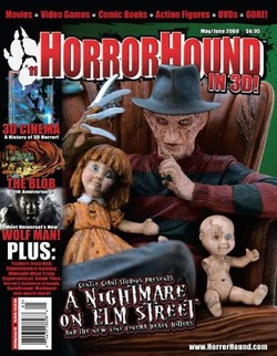
Due to us as a group doing the slasher sub-genre, my main focus was magazine's featuring the killer's who starred in slasher movies, as you can see Freddy Krueger, as the main image which was certainly the main thing that caught my eye.
1.) The reason why i like this horror magazine and consider it to be one of my favorite magazine is firstly the main image, mid-shot with Freddy Krueger sitting on the chair with two dolls, what also i like is the doll's remind me of chucky which is also based on a slasher. Furthermore i love the masthead, the name 'Horror Hound' with the use of alliteration makes it catchy and snappy to say, the use of font on the masthead stands out a lot, I like the way there have made red the main colour as it creates the sense of danger and blood which connotes back to slasher movies, i also love the use of white highlighting of the letters in the background to make it stand out more and catch the audience's eye.
2.) What make's this horror magazine a horror magazine is the use of font used on certain text, For example the font used on 'A nightmare on elm street' is crooked and crinkly which is used mainly in horror, especially in like the film you're next, if you watch the trailer there use a similar font.
3.) Me as an audience is effected a lot, it has a huge effect from just looking at this magazine, it made me want to watch one of Freddy Krueger's film's, it also make's me give good 'word of mouth' which also links back to our audience research, lastly it has an effect on me as an audience to want to buy the magazine and read and find out more about the legendary Freddy Kruegar.
4.) This magazine can benefit me as a creator, as it has given me more things to take into consideration when doing my final magazine product, making sure the image is in focus, it is a quality picture and stands out and is able to catch the audience's eye, also placing my cover line's and secondary images (if used) in the right places, so it doesn't take out the main focuses which are the Masthead and Main image.
5.) This magazine has given me the inspiration to take a mid shot photo of my killer, which can potential catch more audience's eye, it also has inspired me to play around with different fonts and not just try one, by doing this i can see which font stands out more which will enable my masthead stand out. The idea's that this magazine has given me is to use secondary images this will allow the audience to see other things which will be featured in the magazine which could make them more likely to buy our magazine.

My second magazine i picked which inspired and caught my eye is 'SCREAM', as you can see one the front cover, the main image used is also a killer which starred in slasher movie 'Friday 13th', Jason and Freddy are very similar characters as there both have some sort of disguised face with a weapon which is most common in slasher movies.
1.) The reason why i liked and picked this magazine in particular is the mainly the main image, the masthead didn't really have influence me, as the use of yellow doesn't really connote nothing in a horror, however the use of font is what i liked the use of each letter dripping down with paint, if there used red instead of yellow this could have connoted blood. With the masthead as Jason, a close up shot with him holding his legendary weapon and his mask caught my eye out, his stance and his non identified characteristics makes it so eye catching and make's you want to look more in to it.
2.) What made this magazine a horror magazine is the name of the magazine 'SCREAM' which is heard in horror film majority of the time, especially in slasher's as there tend to use Laura Mulvey's theory 'Final Girl' who majority of the time is screaming for help, what also made this magazine horror is the main image the use of the mask and the big machete in his hand shows that it is a horror.
3.) This effects me as a audience as it makes me want to watch Friday the 13th again, as the image is so eye catching and stands out a lot, it also makes me wanna buy the magazine and find out more about the killer 'Jason' as often magazine's give key information about the killer in a magazine.
4.) This magazine benefited me as a creator as it has made me see a real life existing magazine, and has enabled me to see the type of expectations to meet when doing our final product magazine, it has also made me understand how powerful the image must me especially as it is your main image and also the use of font types used and where the main cover line should be.
5.) This magazine has given me the inspiration to proceed with using a mask for our main image and also have a special weapon for our killer as well as Jason, Also to use a unique horror font and take into consideration the colour used for the font used. This magazine has given me the idea to make the main cover line right next to the main image.
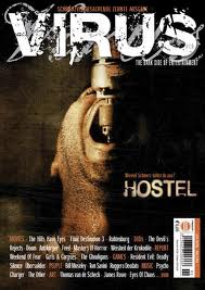
My third magazine i decided to choose was 'VIRUS' the main image was so powerful and caught my eye in a instant, as you can see the main image is a man it seems to be getting tortured as a drill is getting put in to his mouth, this could b consider as the sub-genre splatter which shows gushy and grim scene's in movies.
1.) The reason why i liked and picked this magazine is firstly the font used for the masthead 'VIRUS' it is so unique and i have never seen it been used for a horror magazine before i the use of white as it makes it stand out, also the reason why i like this magazine is mainly the image, it made me want to find out why is that happening to the victim and who is behind it, the use of a close up shot allows you to see the drill going through his mouth and most probably piercing through his tongue, this can be told by expression around his mouth.
2.) The thing that makes this magazine a horror is the main image, its a picture what appears to be a man being drilled in the mouth, which is pretty brutal. Despite this, there is no blood, because its more professional for a horror magazine to not have blood and guts out on its cover, but we can still tell that the movie ''Hostel'' is quite violent. This alone makes the magazine good, that it can tell the audience what the movie is like without them physically showing them. Also, the way that the orange and white tones contrast against the background implies that it is horror magazine.
3.) This effects me as an audience as the picture is very powerful and makes me wanna find out why is this behind done to the victim and what type of antagonist would enjoy this. It makes me wanna watch the trailer for the hostel and then the full movie, it also makes me wanna buy the magazine and find out if there's any information relating to the killer and victim.
4.) This magazine has benefited as a creator as i understand now how professional my magazine needs to be, not to sure explicit pictures of bloods and guts as the audience will still be able to the tell how violent our movie would be. It also has made me understand how strong the main image must be, and it also has reminded me that it would be good to add our slogan on the front cover and bar-code.
5.) This magazine has inspired to me to be more open with the slasher genre and don't be afraid to present a powerful and explicit picture, but to know the limits in order to keep our magazine very professional, it also has inspired me to maybe consider the main picture for the front magazine as the victim about to get tortured.

The reason why i also picked this as a magazine as it featured Jason again, Jason's stance was very eye catching with him holding the long machete in his hand. Jason who starred in Friday 13th has inspired me a lot which is also why i picked this magazine to do.
1.) I liked this magazine as the use of masthead, the font is nice, big and bold and the use of colour connotes danger, i also loved the way there used Jason's head as the O in Fangoria which is very eye catching. I also like this magazine due Jason's stance it makes me think why is he standing like that, and who is his next victim, This is shown by the use of a long shot showing his whole body as the front cover, this also shows how big Jason is, showing the dominant and powerful man.
2.) The thing that makes this a horror magazine is the mainly the image, which shows Jason standing with a long machete in his hand which implies he is looking for his next victim to find and kill. We can tell that 'Friday the 13th' is quite violent, this is shown by the weapon in his hand, this alone makes the magazine good.
3.) This effects me as a audience as it makes me want to watch Friday the 13th again, as the image is so eye catching and stands out a lot, it also makes me wanna buy the magazine and find out more about the killer 'Jason' as often magazine's give key information about the killer in a magazine.
4.) This magazine benefited me as a creator as it has made me see a real life existing magazine, and has enabled me to see the type of expectations to meet when doing our final product magazine, it has also made me understand how powerful the image must me especially as it is your main image and also the use of font types used and where the main cover line should be.
5.) This magazine has given me the inspiration to proceed with using a mask for our main image and also have a special weapon for our killer as well as Jason, Also to use a unique horror font and take into consideration the colour used for the font used. This magazine has given me the idea to make the main cover line right next to the main image.
Existing Horror Film Poster's

Due to us as a group doing the slasher sub-genre, my main focus was film poster's featuring the killer's who starred in slasher movies, as you can see Jason, as the main image which was certainly the main thing that caught my eye. Overall i like this poster as it is probably the most similar to our own, we like the stance of 'Jason' and the way he holds his weapon, we like the setting and the use of black, dark grey with a little bit of light to connote evil or that something dark here. Also like how the poster demonstrates that themes of this film are: a serial killer, which slays victim. This is recognized and established by the use of mise en scene. For example a phallic symbol, such as the weapon demonstrates that victim would be slayed. The trees and an isolated woods in the background connotes that nightmares take place because an isolated location such as; the woods signifies a trapped and venerable are for victims.

Insidious was a very unique film poster, especially with there use of the name being sideways. I love the use of typography as ''Insidious'' is written in red and white font this creates enigma of audience's coming suspicious of thinking what is insidious? I also love the two colours red and white which are complete different opposites. For example, red is associated with blood, warning and danger whereas, white is associated with heaven and innocence. These ideas of the two colours links with Roland Barthes theory of Good Vs Evil and Innocent Vs Villain. I also like that the background of the poster reveals that the film challenge's the conventions of horror. For instance, the cloudy thunderstorm implies that something dangerous and sinister is going to happen throughout the film. As revealed, in the poster the use of low key lighting and dark shadows conveys a sense of the boy, controlled and taken over by a dark evil force. I also love the use of camera shot, which is a mid shot signifies that the boy is portrayed as evil and possessed by darkness and evil forces. This connotes that the innocence of an innocent boy has been transformed and influenced by darkness.

For Halloween 2 i loved the use of iconography used, the use of low key lighting establishes that something sinister is going to happen throughout the film. For example, the lighting signifies that a villain is involved because low key lighting is associated to; hell, fear and darkness. The use of this lighting conforms to creating a juxtaposed feeling of tension, suspense, and fear for audience's. Furthermore I love the use of his body image with his hand up in the air with a knife pointing down implying that he is the killer. Lastly i like that the poster demonstrates that themes of this film are; nightmares, good vs evil, and a serial killer, which slays victims. Halloween 2 is a great film poster and has inspired us a lot.
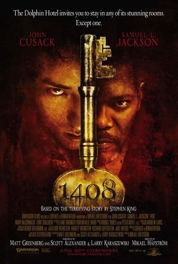
This film poster '1408' influenced us a lot mainly due the key as the main image, due to our horror being called LOCKED, the key gave us an idea that we could use for our horror movie, 1408 is a psychological horror. What i liked about this poster is how the two actors blend in on both sides of the key, what i also liked is you can tell who is the bad guy and who is the good guy to a certain extent by there facial expression. I love the use of colour as red being the primary colour which connotes blood, danger and warning. This film poster is very inspiring, the fact that there have 4 numbers on a key already is kind of psychological. But this film poster gave us the idea of using a key whole as a potential main image for the film poster. 1408 film poster has enabled us to brainstorm our ideas and this poster has benefited us a lot.
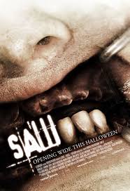
Lastly saw 3 has also inspired me and gave me ideas in order to produce an amazing horror poster, what really caught my eye is the 3 teeth left in his gum's, The image is very powerful and strong and stands out amazingly. I love the way there have taken out the colour, and made his gums dark, to stop showing blood gushing out, showing how professional there are when there made the film poster. I love the close up shot making sure there show that there is only 3 teeth in his mouth showing a sign of torture but also to show that it is saw 3, i also love how there is a metal thing in the corner of his mouth, and by the way his mouth is, it shows that his mouth is being pulled open probably so the person can take out the remaining three teeth. Saw 3 has inspired me to take risks and be able to try out more explicit posters if i wish to. saw 3 has also gave huge ideas for our final film poster.
Drawn Drafts Magazine
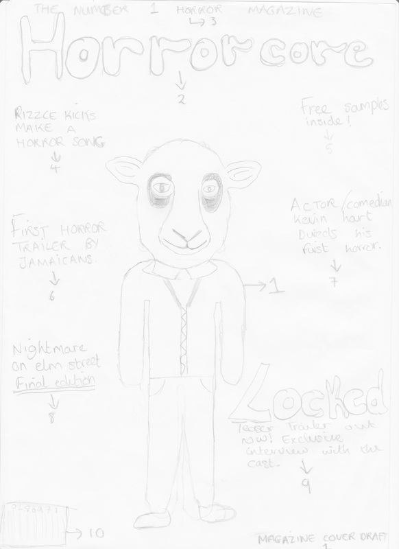
Magazine Front Cover Draft 1:
1.) Is the main image, as you can see its the man in the mask standing there, i got this idea from 'Jason' in Friday 13th as if you look at there poster and magazine you can see 'Jason' has a similar stance. 2.) Number 3 is the masthead, we came up with the idea for our magazine name to be 'Horror-core' what basically did was take the hard out of hardcore and replace it with horror, when deciding to go with this name for our magazine, we asked people our friends and family and the most common response was its a great idea as it is unique and very quick and snappy to say . 3.) Number 2 is the main image which is the selling line, this is a key convention in a magazine, and needs to be in a magazine. 4-8.) Numbers four to eight are all potential cover lines that can be used for our final products, when doing the real magazine the font's will vary between each cover line. 9.) Number is the main cover line this features our horror idea 'Locked' and is going to be bigger than the other cover lines so it stands out and the audience know whats the main topic in our magazine. 10.) Is the bar code, now anything that's bought needs to have a bar code on it our magazine is going to be a reasonable price for consumers. 
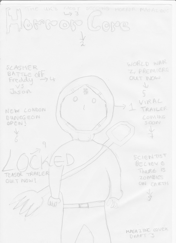
Magazine Front Cover Draft 3:
1.) Is the main image, i decided to play around with the mask as it is not 100% that we are going to use a animal mask, so i decided to do a similar mask like 'Jason' from 'Friday 13th' which is a hockey mask, you can also see the similar stance the only difference is, is that 'Jason' holds his weapon but our killer carries it on his back. 2.) The masthead 'Horror core' which is a unique horror name and hasn't been used before, when doing our real magazine we need to consider the font being used and the colour also being used, as there should both link back to the horror genre. 3.) Is the selling line which says 'The U.K's most selling horror magazine' this could be very attractive to consumers as there would consider this as the best horror magazine to buy. 4-8.) Are all the potential cover lines which can be used in our trailer, i changed some of them with different cover lines so when doing our final product we can look at our drafts and pick out the best ones. 9.) Is the main cover line which features our horror as the main plot of the magazine, we are going to show this by making the writing bigger than the other cover lines exactly how its done above. |
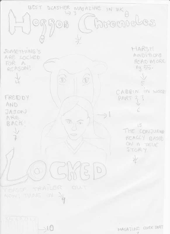
Magazine Front Cover Draft 2:
1.) Is the main image, this shows the killer and victim in the image together from our audience research majority of people wanted this to be on our magazine, this can make the magazine more attractive for audience. 2.) Number 2 is the Masthead, we also came up with another potential name for our magazine which is 'Horror Chronicles' chronicles means a description of past events which is what our magazine is giving to consumers. 3.) Is the selling line we changed the selling line to 'Best slasher magazine in the U.K' due to our horror being based on the slasher genre, we wanted to make sure our audience knew our magazine is a slasher this is because when doing audience research people said that slasher is the best sub-genre. 4-8.) All these numbers feature potential cover lines that also can be used for the final product, we have changed up different cover lines, and we are going to ask people what cover lines will be the best to use for our final magazine. 9.) Is the main cover line as this is our horror which needs to stand out from the rest of the cover line's we tend to change the font and make sure it is bigger than the other cover-lines but is smaller than the master head. 10.) Is the bar code which is a traditional convention on any magazine. 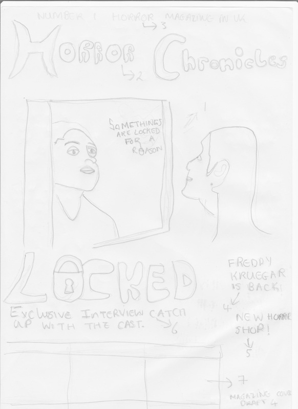
Magazine Front Cover Draft 4:
1.) This is the main image, as you can see the girl looking the mirror, due to us doing our storyboard which helped us structure the way our horror trailer is going to be, there is part where the female is looking in the mirror, so i decided to draw this as a main image, this can attract the audience, as it makes them think why she looking in the mirror? and whats about to happen next? 2.) Number is the masthead 'Horror Chronicles' as you can see i have played around with the font and made it a bit more related to horror, in order for us to decide which magazine name to use we have to do more audience research and see what our audience think. 3.) Number 3 is the selling line which says 'Number 1 horror magazine in the U.K' which can attract audience as there will see it as the best magazine in the U.K. 4-5.) In this magazine i fought i would reduce the cover lines by just two as not all consumers want to see lots of writing, as some may want to see more imagery. 6.) Is the main cover line as you can see, i decided to be a bit creative by replacing the O with a padlock, this makes the main cover line stand out more and catch more of the audience's attention. 7.) Is where secondary images will go this will enable consumers who prefer imagery of writing to see more images on the front page. |

|

|
|

|
Film Poster Drafts
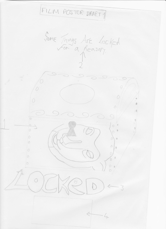
Film Poster Draft 1:
1.) Number 1 is the main image, due to us doing a horror called 'Locked' we came up with the idea of putting the mask in the 'Locked' box as an idea. 2.) Number 2 is the slogan 'Somethings are locked for a reason' putting this on the film poster is essential as it can make more audiences talk about it which can potentially increase consumers attraction to the film poster. 3.) Number 3 which is labelled in the poster is the masthead/headline which is always essential for a film poster, as it allows the audience to know the name of the film if there want to find out more e.g. going on YouTube to watch the trailer. 4.) Number 4 is where names go for people who had some roll within the production, exhibition or distribution stage of the movie. This was vital for our horror film poster as it is a traditional convention of film posters. 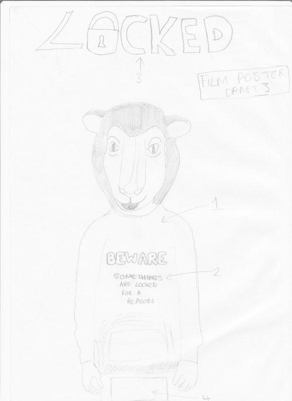
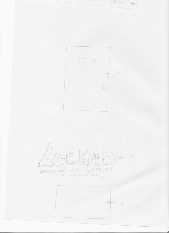
Film Poster Draft 3:
1.) Number 1 is the main image, as you can see the guy in the mask standing, with a mid shot camera shot, wearing a jumper saying beware, which can attract a lot of consumers. 2.) Number 2 is our slogan which is ' somethings are locked for a reason' i had the idea of putting on his jumper as consumers are most likely to look at the image first other than anything else. 3.) Number 3 is the masthead which is 'Locked' the name of our horror, i made sure it was in capital letters so it could stand out and from previous drafts, i used the idea to take out the o and replace it with a pad lock, connoting back to our horror 'Locked'. 4.) Is a traditional thing for a horror film poster, this where everyone who participated in making the magazine, poster or film goes, also the companies that are going to distribute the products. |

Film Poster Draft 2:
1.) Number 1 is the main image, as you can see its a different type of mask, from doing online research at different animal mask for our film trailer we saw that a Fox mask was actually scary, so due to us not deciding our mask yet, i fought it would be good for a draft just in case we go with the fox, i decided to do a close up shot of it to make it look different from previous drafts. 2.) Number 2 is the slogan which always needs to be featured on the film poster. 3.) Number 3 is the headline/masthead, as you can see i joint the slogan and masthead together with the use of a closed padlock which represents something is 'Locked'. 4.) Number 4 is always vital for a film poster as it shows which people played a part in the making of the film. 
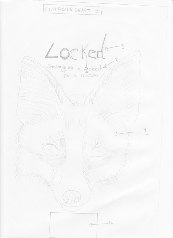
Film Poster Draft 4:
1.) Number 1 is the main image which is just a normal basic door, this can attract a lot of consumers as there is not much hints to what this horror is about, and consumers may become curious and try find out more this means watching the teaser trailer and buying the magazine. 2.) Number 2 is the slogan which is has to be on the film poster as it can be seen as a persuasive technique to attract more consumers to watching the trailer and buying the magazine. 3.) Number 3 is the main headline, in this one i have tried to play around with the font a little buy trying to show pieces bitten out of the letters especially the L. This makes the headline stand out more. 4.) Number 4 is always featured on a film poster as it is a convention of a film poster and film poster wouldn't be one without it. |
Overall Conclusion On Drafting:
To conclude my time of drafting was a big factor in order to prepare us to what our potential final products are going to look like, especially in the film poster and magazine, By doing these drafts has allowed me to learn new things, generate more ideas for our final product, i also have learnt to take in consideration where things should be, what font should be used and what type of effect can this have on the audience. Drafting has been a big help in order for me to move on the next step which is the production stage.
To conclude my time of drafting was a big factor in order to prepare us to what our potential final products are going to look like, especially in the film poster and magazine, By doing these drafts has allowed me to learn new things, generate more ideas for our final product, i also have learnt to take in consideration where things should be, what font should be used and what type of effect can this have on the audience. Drafting has been a big help in order for me to move on the next step which is the production stage.

|
|
|

|
Photoshop Drafts
Additionally for our DRAFTING not only we had to annotate existing magazine and posters, doing initial drafts for our horror idea then transferring them on to Photoshop. we also had to take some test photo's this was done by me Jordan, I took 6 different pictures which were similar to the drafts i drew. These photo's were taken to help me see how it would look real life, to get a hold on the camera and practice for the final product to come in November, and also to see if i would change anything in my drafts. Due to it being test shots it wasn't entirely important to who was photographed. What worked well was practically everything the person i photographed was actually good for the job and now wants to help out with the final end product, all the pictures came out really good, one thing i could say to improve on is taking more images, to wider my options when it comes to final products. Below shows a slideshow of pictures which were taken on Thursday 10th October 2013.
