
Magazine Analysis (Jordan)

Introduction: This magazine is a cineworld magazine which is one of the most popular film magazines in the UK. The purpose of this magazine is to work alongside cineworld cinema's to help promote awareness of rising films. This in the long run will help increase film profits and box office, as consumers are more aware of new releases. Cineworld have recently moved in to a app for the magazine which has 640,000 subscribers.
Mise En Scene: Lighting: The lighting in this image is quite dark and this creates a gloomy atmosphere which highlights that this film is from the horror genre. However, one side of the actor Daniel Radcliffe face is highlighted through the lighting and this perhaps shows that there is two sides to this character as one is in the dark half and one is in the light half. The use of light on one side of his face can imply that there is some hope of the character succeeding in the film as often light is associated with positive.
Setting and Colour: The choice of using a cross in this image connotes the idea of the death and the way the cross is placed next to the woman in black foreshadows that she is connected to this theme. This is shown though the choice of costumer the woman in black as from first impression the idea of grim reaper is portrayed, as the colour black and the cloak is often associated with death. The house can be seen in the distance of the image and the way this has been placed in the center of the image connotes that this will be the main setting for the film. Even though the house appears empty and abandoned, there is one light in the house which suggests that something or someone is in the house. The grey cloud and fog used in this image creates a negative atmosphere which using the weather is a convention of horror as it creates a gloomy feeling.
Main Image/Layout/Composition: The main character (Daniel Radcliffe) is in the forehand of the image and because of he is unaware that the woman in black is behind him. This is an example of dramatic irony when a audience can see that this figure is in the background there whereas the character is unaware of this. The character is placed close to the left hand side of the magazine cover and this creates a feeling that he is trapped as he is given little room.
Type Of Font: In this front cover magazine there use more sans serif fonts as there is no flick ups and by looking at the text it is more generally connoting a more modern feeling.
Masthead: The masthead 'Unlimited' includes the typical conventions that is expected of a magazine including this title, the date and the price. The masthead 'Unlimited' suggests that consumers are receiving all the information that they could possibly need to know about films that are due to release. Also because unlimited magazine is free, all cinema attenders have the same opportunity of purchasing a magazine and receiving this exclusive film information. this may appeal more to the working class as they are most likely to be the ones who are attending the cinema. By including the cineworld logo in the masthead reminds the consumer that the information including is exclusive to those that attend the cinema. The information included in the magazine will not only help to increase cinema profit as people are becoming increasingly aware of new releases but will in the long run help a film to be more successful. The masthead is very attractive with the use of the bold writing and the red in the background with the white writing can be very attractive to consumers making more people get the magazine.
Dateline: February 2012 and the magazine is free.
Main Image: The main characters eyes stand out compared to the rest of the image because they are blue and this connotes the idea that the character may be quite sad and cold which is fitting the story line. The character in this image shows little expression as he appears quite distant and serious. This creates a sense of mystery as it unclear who this character is or why he shows little emotions and therefore it is more likely that someone will pick the magazine up to find out more. The ghostly figure in the background may not be properly noticed first as attention is drawn to the main character due to him being in the forehand image. The ghostly figure creates a negative and mysterious atmosphere as it is unclear who and why is this figure there. In this main image there is also rule of thirds. The magazine front cover does not fit particularly well with the rule of thirds, There is no specific point of the image that fits the intersections and therefore the eye is not necessarily drawn to anything particular. The only aspect of the magazine that matches the intersections is the word 'ghost' yet due to the colour's and striking image, this is not really noticed. The image however, does gain attention due to the character's facial expression and the blue eyes which do fit the vertical lines of the rule of thirds.
Main Cover-line: The magazine uses white and blue text for the main cover-line ''The Woman in black'', the white texts creates a ghostly feel and this is relevant to the films story line as the cover line that concludes what the film is about implying that this is ''Supernatural'' sub genre. A cold and chilling feel is created though the blue text that is used and again, this is associated with the idea of shots and feelings of the supernatural so here the magazine is foreshadowing the feelings that are likely to be experienced when watching the film. The main cover-line is made bigger and bolder compared to the rest of the text and this makes it stand out more. This is more likely to gain attention from a consumer as it appears to be a mystery who the woman in the black is, which means the magazine is more likely to be looked at my customers.
Cover-Lines: Firstly, the image used addresses the target audience, as the image of the main character is similar in terms of age as the target audience and this will hopefully entice them to look at the magazine and view the film. One of the cover-lines on this magazine uses a quote ''Do you dare to see this chilling ghost story'', The pro-noun, you, directly questions the customers and though using capital letters creates an intimidating approach. The choice of words ''dare'' and ''chilling'' has a feel that the consumers are being challenged to go and watch the film. Underneath the main cover-line, there is a small summary explaining the main image. This implies that this version of the story is unique as it is described as a ''thrilling screen version'' and this word ''classic'' suggests that this version will be different to what is expected therefore, audiences are more likely to pick the magazine up to find out more information.
Bar-code: Due to the ''Unlimited'' magazine being free, there is no bar-code.
Selling-Line: This magazine does not have a selling line as the magazine is free there attract consumers by the big masthead which is white writing with a red background, soft bright colour's more likely to attract readers to the magazine.
Magazine Analysis (Riley)
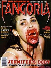
Masthead: The masthead for this magazine is "FANGORIA". The masthead is in red font and looks like two fangs either side which links in with the masthead and the main image on the magazine with the girl with the bloody fangs.
Main Image: The main image is a medium close-up of a main character of a new horror movie. She is positioned slightly side on and holds no eye contact with the camera. Her facial expression is very gory with blood dripping from her fangs portraying a very dangerous, horrific character.
cover-lines/main cover-line: the main cover-line is "Jennifer's Body- Megan Fox will eat you alive!", this is making a reference to the main image.
lighting: the lighting used in the main image is quite high-key as the main subjects face and body is well lit.
colour scheme: the colour scheme is black and red which connotes death, blood, danger, and gore. this fits the 'theme' of the magazine which is horror.
Magazine Analysis (Diana)
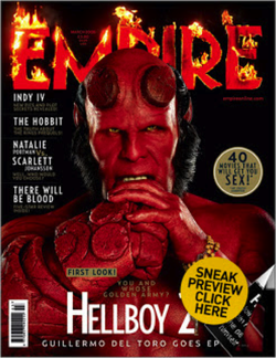
MASTHEAD: “EMPIRE” is the masthead of the movie magazine seen above, written across the top of the page. The mast head is red and fiery which is usually associated with hell, which ties in well with the image and cover line “Hell Boy” The colours and effects used for the mast head are bold and eye catching, which tends to be the aim of a masthead.
DATELINE: Informs the reader of the month and year of the publication, often with the price.
SELLING LINE: Is usually a short and sharp description of the title’s main marketing point.
BAR CODE: The bar code for this magazine is clearly shown in left bottom hand corner of the front cover.
MAIN IMAGE: The main image is a close up shot of a fictional character named “Hell Boy” from the movie Hell Boy, looking directly towards the camera with a serious facial expression. The image is symmetrical and directly placed in the centre of the page. The subject has their hands folded looking like their ready to fight; this may portray the subject as a ‘tough’ ‘feared’ person.
COVER-LINES/MAIN COVER-LINE: The main cover line says “you and whose golden army?” This makes reference to the release of the new Hell Boy. This quote implies that there’s only one leader and that leader is of course “hell boy” who is represented as superior.” runs things” The cover lines are clearly and carefully placed on the left hand side of the front page in white sans serif font, the cover lines do not run over the main image or detract from it.
LIGHTING: The lighting is quite low, which sets a dark mood and atmosphere.
COLOUR SCHEME: The colours used on this front page cover are Red, White and Black. Black connotes darkness, in contrast white is usually associated with positive things like peace, happiness and Red usually connotes, death, evil and danger. The colour scheme suits the theme of magazine and subject, who is supposedly representing “the devil”
LEFT THIRD: The left third of a magazine cover is essential for sales in shops; most importantly the title must be recognisable.
